- 締切済み
height:100%を使用した入れ子の表示

weakweakの回答

- weakweak
- ベストアンサー率34% (350/1003)
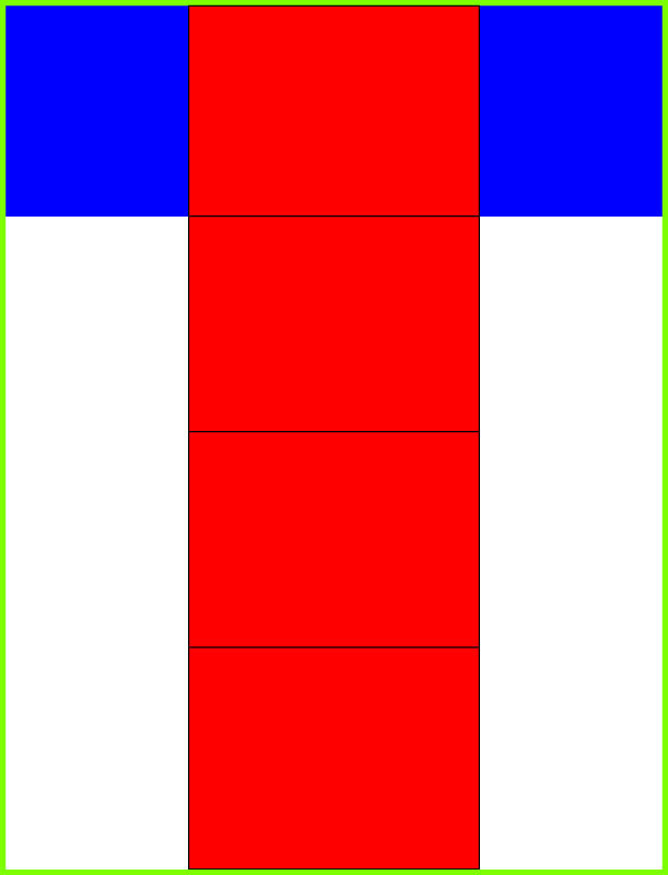
「ソースの#borderで全てを囲むボーダー線は出せないのか」ということですが、先の私の書いたhtml/cssで実現してません?私がしたことは#borderを.wrapperに変えただけです。 他回答者さんが「デザインの為にhtmlは書かない」という話があったので、.wrapperを削る場合は以下のようになると思います(これに関しては単に.wrapperっていう名前が悪いだけで、#mainとかいう名前だったらいいんじゃないのかなとか個人的には思うんですが・・・)。 とにかく、以下のポイントが分かればどのような書き方もできるんではないでしょうか? ・height:100%はブラウザウィンドウのサイズに対して100%で固定。 ・min-heightは可変だが最低限の高さを指定する。 ``` <!DOCTYPE html> <html lang="ja"> <head> <meta charset="UTF-8"> <title>Document</title> <style> html, body{ margin: 0; } html{ height: 100%; } body{ min-height: 100%; box-sizing: border-box; border: solid 5px red; } .footer{ height: 50px; background-color: lightgray; } .section{ height: 0;/*500pxとかに変えてみて*/ width: 100%; border: solid 5px blue; } </style> </head> <body> <div class="section">Hello1</div> <div class="section">Hello2</div> <div class="section">Hello3</div> <div class="section">Hello4</div> <div class="section">Hello5</div> <div class="footer">コンテンツが足りなくても、html,body{height:100%}と、ここがせり上がらない。</div> </body> </html> ```
関連するQ&A
- height:100%を使用してボーダーで囲む
下記のソースのボーダー代替で使用している部分 body { padding: 5px 5px 0 5px; background:#000; } .container:last-child { border-bottom: solid 5px #000; } を削除し body { border: solid 5px #000; } もしくは他の要素を追加で ボーダー(border: solid 5px #000;)で表示させること出来ないでしょうか? *#headerを画面一杯に表示させたいのでhtml,body,#headerにはheight:100%,width: 100%;を掛けています。 *HTMLソース (インデントの代わりにアンダースコアを使用しているので戻してください) <body> __<div id="header" class="container"> ____<div class="inner"> ______<header> ________<p>Header</p> ______</header> ____</div> __</div> __<div class="container"> ____<div class="inner"> ______<section> ________<p>Section-1st<br /><br /><br /><br /><br /><br /><br /><br /><br /><br /><br /><br /><br /><br /><br /><br /><br /><br /><br /><br /><br /></p> ______</section> ____</div> __</div> __<div class="container"> ____<div class="inner"> ______<section> ________<p>Section-2nd<br /><br /><br /><br /><br /><br /><br /><br /><br /><br /><br /><br /><br /><br /><br /><br /><br /><br /><br /><br /><br /></p> ______</section> ____</div> __</div> __<div class="container"> ____<div class="inner"> ______<section> ________<p>Section-3rd<br /><br /><br /><br /><br /><br /><br /><br /><br /><br /><br /><br /><br /><br /><br /><br /><br /><br /><br /><br /><br /></p> ______</section> ____</div> __</div> __<div id="footer" class="container"> ____<div class="inner"> ______<footer> ________<p>Footer<br /><br /><br /><br /><br /><br /><br /><br /><br /><br /><br /><br /><br /><br /><br /><br /><br /><br /><br /><br /><br /></p> ______</footer> ____</div> __</div> </body> *CSSソース * { margin: 0; padding: 0; box-sizing: border-box; } body, html { width: 100%; height: 100%; } body { padding: 5px 5px 0 5px; background: #000; } .container { width: 100%; height: auto; background: #fff; } .inner { max-width: 960px; width: 100%; height: auto; margin: 0 auto; } .container:first-child { width: 100%; height: 100%; background: #3498db; } .container:last-child { border-bottom: solid 5px #000; }
- 締切済み
- CSS
- Divの入れ子とHeight
こんにちわ。初歩的な質問かもしれませんがお願いします。 DivのContainerの中にPosition:Absoluteの3つのDivを入れ子にしたいんですが、Containerの高さを中身のDivの高さに依存する形にしたいのですが、うまくいきません。 Containerの高さと中身のコンテンツの高さをAutoにした場合、中身のほうは内容に依存する形で高さが自動になるんですが、Containerのほうがうまくいきません。FloatをつかわずにPosition:Absoluteでして、Containerを中身の高さに依存、という風にする方法はないのでしょうか? こちらがコードです。 HTML CODE <HTML> <HEAD> <link rel="stylesheet" href="hp.css" type="text/css" /> </HEAD> <BODY> <div class="container"> <div class="banner"> </div> <div class="menu"> </div> <div class="main"> a<br>a<br>a<br>a<br>a<br>a<br>a<br>a<br>a<br> </div> </div> </BODY> </HTML> CSS CODE * {margin:0;padding: 0;} div.container{border:2px solid RGB(888888); position: absolute; top:20px; left:50px; width:900px; height:auto;} div.banner { position: absolute; top:20px; left:80px; width:700px; height:150px; border:2px solid RGB(888888);} div.menu{ position: absolute; top:190px; left:30px; width:150px; height:300px; font-weight:bold; border:2px solid RGB(888888);} div.main{ position:absolute; top:190px; left:200px; width:600px; height:auto; border:2px solid RGB(888888);}
- ベストアンサー
- HTML
- CSS 左右違う大きさのボックスでheightを合わせたい
外部CSSでHPを作成しています。 基本的なことかと思いますが、調べてもどうしてもうまくいかないので 皆さまのお力をお貸しください。 左右にボックス(で良いのでしょうか?)を置き、その中にテキストを入れています。 それぞれ文字数が違うためheightのサイズがばらばらのため、現在指定していません。 固定すれば解決しそうですが、縦には数十個のボックスを並べているのでできません。 どのようにしたら文字数の少ないボックスを、文字数の多いボックスに合わせられるのでしょうか? また、テキストを何も入れていない状態で、左右のheightがずれているのはなぜなのでしょうか? どうぞご教授ください。 よろしくお願い致します。 /*CSSファイルの記述*/ .waku1{ border : solid 1px #999999; border-bottom: none; width :150px; float : left; background-color : #e8e8e8; line-height: 160%; } .waku2{ border : solid 1px #999999; border-left: none; border-bottom: none; width :335px; line-height: 160%; word-break: break-all; } .waku3{ border : none; border-bottom: solid #999999 1px; border-top: solid #999999 1px; width :150px; float : left; background-color : #e8e8e8; line-height: 160%; } .waku4{ border : none; border-bottom: solid #999999 1px; border-top: solid #999999 1px; border-left: none; border-bottom: none; width :335px; line-height: 160%; word-break: break-all; } .clear{ clear : left; } /*HTMLファイルの記述*/ <div class="waku1"></div> <div class="waku2"></div> <div class="clear"></div> <div class="waku1"></div> <div class="waku2"></div> <div class="clear"></div> <div class="waku1"></div> <div class="waku2"></div> <div class="clear"></div> <div class="waku3"></div> <div class="waku4"></div> <div class="clear"></div>
- ベストアンサー
- HTML
- Safariでheight:100%のボックスを表示したいのです
Safariでheight:100%のボックスを表示したいのです。MacIE・WinIE・FireFox・Operaでは出来たのですが、どうしてもSafariだけheight:100%のボックスが出来上がらず・・・。 以下、記述したCSSとHTMLです。 HTML--------- <body> <div id="main"> <h1>height100%のボックス</h1> <p> 標準準拠のIEやfirefoxでbody直下にheight100%のボックス </p> ・・・略 <h1>height100%のボックス</h1> <p> 標準準拠のIEやfirefoxでbody直下にheight100%のボックス </p> ・・・略 </div> </body> </html> CSS--- /* \*/ html{ height:100%; } /* \*/ body{ height:100%; width:80%; margin:0px auto; padding:0px; } div#main{ background-image:url(../images/contents_bg.gif); border:solid 1px #760014; border-width:0px 1px; height:100%; min-height: 100%; margin:0px auto; padding:0px; border:1px solid #ff0000; } body > #main{ height: auto; } h1{ margin:0px auto; padding:0
- ベストアンサー
- HTML
- div入れ子による height100%
お世話になります。 親要素のdivは縦100%になるのですが、 入れ子のdivが縦100%にならず困っております。 検証ブラウザは、IE6、IE7、FF2、Safariです。 お分かりの方、ご教授をお願いいたします。 ▼HTML <!DOCTYPE html PUBLIC "-//W3C//DTD XHTML 1.0 Transitional//EN" "http://www.w3.org/TR/xhtml1/DTD/xhtml1-transitional.dtd"> <html xmlns="http://www.w3.org/1999/xhtml"> <head> <meta http-equiv="Content-Type" content="text/html; charset=shift_jis" /> <title>test</title> <style type="text/css"> <!-- html { height:100%; } body { height:100%; margin:0; padding:0; } #wrapper { background: #99CC00; width:500px; margin-left:auto; margin-right:auto; min-height:100%; } #wrapper-inner { background:#CCFF00; width:450px; margin-left:auto; margin-right:auto; min-height:100%; } #contents { background: #FFFFCC; width:400px; margin-left:auto; margin-right:auto; min-height:100%; } * html #wrapper { height: 100%; } * html #wrapper-left { height: 100%; } * html #wrapperA { height: 100%; } --> </style> </head> <body> <div id="wrapper"> <div id="wrapper-inner"> <div id="contents"> テスト <br /> <br /> <br /> <br /> <br /> <br /> <br /> <br /> <br /> <br /> <br /> <br /> <br /> <br /> <br /> <br /> </div> </div> </div> </body> </html>
- ベストアンサー
- CSS
- 文字と枠線がくっつきすぎている
たとえば、 ←枠と文字の距離を離したいのですが、どうすればいいでしょうか。 普通のテーブルでは、cellpaddingで指定しますよね。下のような場合、どうすればいいでしょうか。 <BODY bgColor=#ffffff> <DIV class=block3 style="BORDER-RIGHT: 0px solid; BORDER-TOP: 0px solid; BORDER-LEFT: 10px solid; WIDTH: 400px; BORDER-BOTTOM: 0px solid; HEIGHT: 30px">←↑ くっついてるのを離したい<BR>くっついてるのを離したい</DIV> </BODY> </html> よろしくお願いします。
- ベストアンサー
- HTML
- 左右の高さを揃えたいんですが
css.divのみでレイアウトする勉強中です。 テーブルのように表示内容によって変化する左右の要素の高さを 揃えるにはどうすればいいのかで悩んでいます。 <html> <head> <style type="text/css"> html{height:100%;} body{height:100%;text-align:center;magin:0;} .head{width:800;background:#f8ffff;border:1px solid #000;} .main{height:100%;width:800;} .left{height:100%;width:20%;float:left;background:#f8f8ff;border:1px solid red;} .right{height:auto;width:75%;float:right;background:#aaaaaa;padding:5px;} .center{height:1500;width:200;background:#00ffff;} .foot{clear: both;background:#444666;color:#fff;} </style> <title>test</title> </head> <body> <div class="head">title</div> <div class="main"> <div class="left"> left <br> <font color=red> ※この要素を右と揃えたい</font> </div> <div class="right"> right <div class="center"> この要素の高さが変わる </div> </div> <div class="foot"> foot </div> </div> </body> </html>
- ベストアンサー
- HTML
- コンテンツとコンテンツの詰まり
Windows XP あるいは8 HTML 4.01 コピー ~ TOP.html copyTOP.css あああああ と いいいいいの間隔はあいているのに いいいいい と うううううの間隔はなぜか詰ってしまっています。 間隔を空けるにはどうしたらいいでしょうか? コードは以下の通りです。 [ HTML 側 ] <!DOCTYPE html PUBLIC "-//W3C//DTD HTML 4.01//EN" "http://www.w3.org/TR/html4/Transitional.dtd"> <html lang="ja"> <head> <meta http-equiv="Content-Type" Content="text/html;charset=Shift_JIS"> <META HTTP-EQUIV="CONTENT-STYLE-TYPE" CONTENT="~"> <title>aaaaaaaaaa</title> <link rel="stylesheet" href="copyTOP.css" type="text/css"> </head> <body> <div id="zentai"> <div id="part"> <p class="title">あああああ</p> <div id="partnerwaku"> <div id="partnerimage"> <a href="" alt="のロゴ" class=""></a> <a href="" alt="のロゴ" class=""></a> <a href=""><img src=".gif" alt="のロゴ" class=""></a> <a href=""><img src=".jpg" alt="のロゴ" class="A"></a> <a href=""><img src=".jpg" alt="のロゴ" class=""></a> </div> </div> </div> <div id="PR"> <PR> <br> <div id="PRsection"> <br> <a href=""> <img src="" alt="" class="PRimage01"></a> </div> </div> <div id="PR2"> <br> <PR> <br> <div id="PRsection2"> <br> <a href=""> <img src="" alt="" class="PRimage02"></a> </div> </div> <div id="columnwaku"> <div id="columnbun"> <p class="title">いいいいい</p> <div id="columncontents"> <p><a href=""><img src =".jpg" class="columnarticle01"></a></p> </div> </div> </div> <br> <br> <br> <br> <div id="PR3"> <br> <PR> <br> <div id="PRsection3"> <br> <a href=""><img src="" alt="" class="PRimage03"></a> </div> </div> <br> <br> <br> <br> <br> <div id="questionnairesection"> <div id="questionnaire"> <p class="title">ううううう</p> <div id="questionnairecontents">えええええ</div> </div> </div> <div id="PR4"> <br> <ddd> <br> <div id="PRsection4"> <br> <a href=""> <img src="" alt="" class="PRimage04"></a> </div> </div> <div id="pagetop"> <br> <br> <a href="#logoimage">ページの先頭へ▲</a> </div> <hr class="beforefooter"> <div id="aboutus"> <div id="aboutussection"> <p class="aboutustitle">管理会社</p> <p><a href="Aboutus.html"><img src ="Aboutus.jpg" class="aboutusimage"></a></p> </div> </div> <br> <br> <hr class="beforefooter"> </div> <!--全体のdiv--> </body> </html> [ css側] @charset "Shift_Jis"; body { overflow-y:auto overflow-x:auto text-align:center; cursor:url("images/.png"); } #allitem{ cursor:url("images/.png"); } #zentai{ width:1000px; margin-left:auto; margin-right:auto; } .title{ margin-top:0px; margin-bottom:0px; font-size : 20px; border-style:solid; width:592px; background-color:#FFFF99; padding:3px; } #part{ clear:left; float:left; height:180px; width:642px; padding-right:147px; font-size : 20px; } #partnerwaku{ height:140px; width:600px; border-style:solid; border-color: #000099; } #PR{ float:left; width:180px; height:120px; } #PRsection{ border-style:solid; border-color: #000099; } #PR2{ float:left; width:185px; height:150px; } #PRsection2{ border-style:solid; border-color: #000099; } .PRimage01{ width:170px; height:80px; } .PRimage02{ width:165px; height:100px; } #kuhaku{ clear:left; height:20px; } #columnwaku{ float:left; clear:left; height:130px; width:790px; } #columnbun{ height:120px; width:600px; } #columncontents{ height:140px; width:600px; border-style:solid; border-color: #000099; } .columnarticle01{ height:70px; width:400px; background-color:#CC99CC; } #PR3{ float:left; width:185px; height:150px; } #PRsection3{ border-style:solid; border-color: #000099; } .PRimage03{ width:165px; height:100px; } #questionnairesection{ clear:left; float:left; height:130px; width:1050px; } #questionnaire{ width:600px; border-radius: 20px; } #questionnairecontents{ height:140px; width:600px; border-style:solid; border-color: #000099; } #PR4{ float:left; width:185px; height:150px; } #PRsection4{ border-style:solid; border-color: #000099; } .PRimage04{ width:165px; height:100px; } 文字制限のため省略
- ベストアンサー
- HTML
- ieとfirefoxでdiv枠に2pxのズレ
宜しくお願い致します。 現在下記のHTMLを作成致しましたが、CSSにてfirefoxとchomeに合わせると ieではdiv枠が2px程左右にズレが生じてしまいます。ieに合わせると逆の現象が生じます。 何が原因なのか判りません。宜しくご教示下さい。 <!DOCTYPE HTML PUBLIC "-//W3C//DTD HTML 4.01 Transitional//EN"> <html lang="ja"> <head> <style type="text/css"> .clear {clear:both; } .clear hr {display:none;height:0px;font-size:0pt; } #wrap {width:810px; text-align:center; margin:0px auto;} #header{font-size:70%;color:green;margin-top:5px;text-align:center;} #menu {width:200px;height:auto; float:left;margin:0;position: relative;} #goods {width:600px;height:auto; float:right;margin:0;position: relative;} #top-title { width:200px;height:70px; float:left; margin-bottom: 10px;background-color:#ffffee; border:solid 1px #336600;position: relative;} #top-menu { width:600px;height:70px; float:right; margin-bottom: 10px;background-color:#ffffee; border:solid 1px #336600;position: relative;} /* position: relative削除したり widthの値を%にしたり色々試してみましたが??? */ .col_01_l{width:295px;height:310px;position: relative; float:left; margin-bottom: 5px;background-color:#ffffee;border:solid 1px #336600;} .col_01_r{width:295px;height:310px;position: relative; float:right;margin-bottom: 5px;background-color:#ffffee;border:solid 1px #336600;} .col_05 {width:200px;height:auto; float:left; margin-bottom: 8px;background-color:#ffffee; border:solid 1px #336600;} .col_06a {width:600px;height:auto; float:right; margin-bottom: 10px;background-color:#ffffee; border:solid 1px #000000;position: relative;} </style> </head> <body> <div id="wrap"> <div id="header"> </div><!-- /header --> <div id="goods"> <div id="top-menu"> </div><!-- /top-menu --> <br style="clear:both;"> <div class="col_06a"> <br><br> </div> <br style="clear:both;"> <div class="col_01_l"> <p>ブラウザieではずれませんが、 chrome、firefoxで、この枠が 右に2pxにずれる。 どのように直せば良いか具体的にご教示下さい。</p> </div> <div class="col_01_r"> <br> </div> <br style="clear:both;"> </div><!-- /goods --> <!-- ################################################################################## --> <div id="menu"> <div id="top-title"> <br> </div> <br style="clear:both;"> <div class="col_05"> <br><br> <br><br><br><br> <br><br><br><br> <br><br><br><br> <br><br> </div><!-- /col_05 --> <br style="clear:both;"> </div><!-- /menu --> <br style="clear:both;"> <!-- ################################################################################## --> </div><!-- /wrap --> </body> </html>
- ベストアンサー
- CSS
- floatを突き抜けて背景の色が無くなる
Firefox等ではタイトルの高さ分だけコンテナを突き抜けてしまうようです。 どうすればよいのでしょうか? タイトルがあるのと、表は画面いっぱいにしたい(高さ100%)という意図があり中々うまくいきません。 是非アドバイス宜しくお願い致します。 <html> <head> <style type="text/css"> html, body{ height: 100%; } #container { height: 100%; color: #000000; background-color: #cccccc; border: 1px solid #333333; } #container:after { content: ""; display: block; clear: both; height: 1px; overflow: hidden; } #title { width: 100%; height: 70px; float: left; border: 1px solid #000000; } .leftBox { width: 20%; float: left; border: 1px solid #000000; } .rightBox { width: 75%; height: 100%; float: right; border: 1px solid #000000; } </style> </head> <body> <div id="container"> <div id="title">タイトル</div> <div class="leftBox"> ナビ<br> a<br> b<br> c<br> d<br> e<br> f<br> g<br> h<br> i<br> j<br> k<br> l<br> m<br> n<br> o<br> p<br> q<br> r<br> s<br> t<br> u<br> v<br> w<br> x<br> y<br> z<br> </div> <div class="rightBox"> <table height="100%" width="100%" border="1"> <tr> <td>表1</td> <td>表2</td> </tr> <tr> <td>表3</td> <td>表4</td> </tr> </table> </div> </div> </body> </html>
- 締切済み
- CSS
お礼
お返事遅くなってすみません ちょっと質問の仕方が悪かったのでソース変えてもう一度質問します。 もし宜しければ http://oshiete.goo.ne.jp/qa/8784003.html までお願いします。